Pi-hole Dns Traffic Visualizer
About the project
Visualize the performance of Pi-hole on the Raspberry Pi Sense-HAT.
Project info
Items used in this project
Hardware components
Software apps and online services
Story
After setting up Pi-hole(an ad and tracker blocking application) on a Raspberry Pi 3, I wanted a way to conveniently view its performance without having to load the web interface. I had a spare Sense-HAT with an LED screen just big enough to display charts that could be interpreted from a distance. The onboard joystick controls would also be useful for adjusting program options interactively.
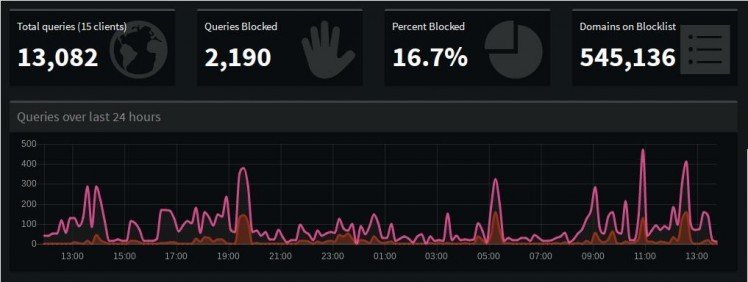
My first step was to recreate the main chart from the web interface(as shown above), which displays the total number of DNS queries and ads blocked on the network in the previous 24 hours. Because of the limited display area, I decided to enable the user to contract or expand the data presented by adjusting the value of the time interval. The addition of color is used to convey either the level of DNS queries generated or the percentage of ads blocked. To improve the visual experience, I added a time delay to create a ripple effect and an option to randomize the order of pixel generation. Contributer Zach Cross added options to change the display orientation and enable low-light mode.
Next I wanted to display the daily percentage of ads blocked, but in a different visual style. I brainstormed different animations that I could use to display the data and thought a spiral pattern would be most interesting. I used the number of red pixels displayed against the blue background to represent the proportion of ads blocked during the last 24 hours.
To access additional statistics regarding Pi-hole performance, I wrote some code to request authorization from the web server. If the user does not have access in the form of a password hash, the program will only display the two charts mentioned above.
I used the third animation to display top clients on the network and the relative level of DNS queries each generates. The chart has the same structure as the first, but with a descending horizontal layout.
Lastly I chose a simple pie chart to represent the proportion of IPV4 to IPV6 queries. The closest I could get to mimicking radial movement was to start generating pixels in a southeast direction from the first to second quadrant and then expanding northwest from the third to fourth quadrant.






Leave your feedback...